cat herding rogue pixels...
1
6
startrek.com
project goal
CBS.com was assigned the task to refresh the current site of Startrek.com. We created a more compelling and immersive user experience that delivers on the overall promise of the Star Trek brand keeping within the parameters of the CBS.com template. The site included a responsive design with an updated structure that improved SEO, a clean savvy premium interface and a current navigation.
roles
Tori Weber: Product Owner
Chris Stone: Senior Art Director &
Product Design Manager & Production Design Manager
Peter Luong: UI Designer
Daryl Harris: UX Lead
Brett Johnson: Developer
tools
JIRA - Project Management
Sketch App - Product Design
Slack - Collaboration and Communication
research

We kicked off the project by exploring some of the most notable science fiction networks available online. These brands included DC Comics, Star Wars and Marvel Comics. We then created mood boards with descriptive words about these products.

We kicked off the project by exploring some of the most notable
science fiction networks available online. These brands included
DC Comics, Star Wars and Marvel Comics. We then created
mood boards with descriptive words about these products.

Screen shot of the home page for DC Comics.com

DC Comics.com

clean
bold
friendly
Screen shot of the home page for Starwars.com

Starwars.com

dark
stylish
powerful
Screen shot of the home page for Marvel.com

Marvel.com

ad heavy
outdated
high-tech
iterations

We created several iterations before we settled on a final look and feel. The difference with this project specifically, was that all of the exploration designs were shown to the client in order for us to make a final decision together. Below are a couple of variations that we produced for the client.

We created several iterations before we settled on a final look and feel.
The difference with this project specifically, was that all of the exploration
designs were shown to the client in order for us to make a final decision
together. Below are a couple of variations that we produced for the client.

iterations
White mobile device with imagery of the star trek logo inside of it
White mobile device with imagery of Karl Urban acting as Doctor Bones for Star Trek the movieWhite mobile device with imagery of the cast of startrek.com inside of it
wireframes

As a team we decided on a solution and created low-fidelity wireframes - pen and marker panels to map out the content. Staying within the adaptive grid of CBS.com's framework, we reorganized and designed a more immersive experience with editorial, video and photo galleries.

As a team we decided on a solution and created low-fidelity
wireframes - pen and marker panels to map out the content.
Staying within the adaptive grid of CBS.com's framework,
we reorganized and designed a more immersive experience
with editorial, video and photo galleries.
Wireframes sketches for startrek.comWireframes sketches for startrek.com
Wireframes sketches for startrek.com
Wireframes sketches with grey and black colors for startrek.com
Wireframes sketches for startrek.com
mouseover
visual design

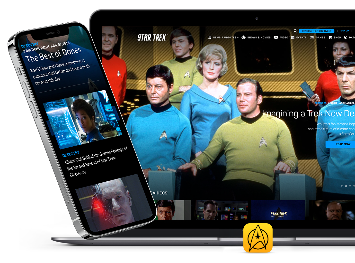
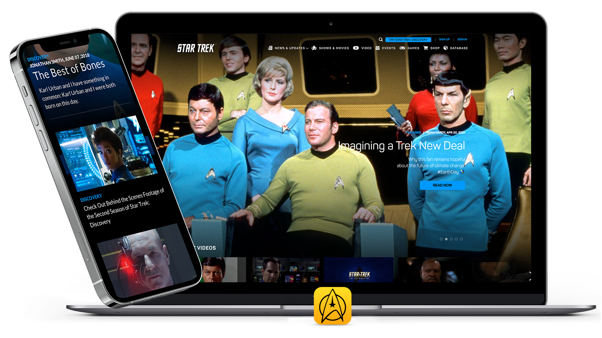
During the visual design phase we applied Star Trek's branding colors and font choices. Although at this stage the site is not developed responsively, the design and experience remain consistent across devices.

During the visual design phase we applied Star Trek's branding colors
and font choices. Although at this stage the site is not developed
responsively, the design and experience remain consistent across devices.

visual design
results

The Startrek.com website redesign went live in April of 2019 while meeting the business goals and requirements of the initial proposal. It's currently live on CBS.com and Startrek.com on responsive web.

The Startrek.com website redesign went live in April of 2019 while meeting
the business goals and requirements of the initial proposal.
It's currently live on CBS.com and Startrek.com on responsive web.